Chart technique facilitates to accentuate price periods that in turn allow various interpretation possibilities. The subjective analysis of charts helps to answer the (two) questions, why the price was trending in such a manner in the past, and whether the price is captured in a dominating formation at the moment, how long this might last, and in what fashion the ongoing price formation is said to be completed.
With the help of chart technique, the 30-year price of gold (POG) can be reduced to 2 superordinate price periods. When the POG was being "liberalized" in the 1970s, there was a triangular price pattern building up in the first 9 years. This was to decide whether the POG shall continue to rise or start declining. The decision was being made exactly with the 5th wave in between the triangle: "The POG is strongly undervalued and shall rise". The price exploded to mark a first strong resistance point: $878.50. After having done so, the POG returned to the apex of the triangle at $330 which is per definition a classical pullback. Subsequently, the POG shot straight up to $500 - an event that gave the impression that the POG was about to thrust above the former marked pullback-resistance zone at $878. But it did not happen! The POG crashed jerkily about $100 after it tried to cross $523 and turned into a downside trend for the following 2 years. This marked a bottom at $300, which was only slightly below the triangle´s apex. Having marked this "second bottom," this time the POG rose for exactly 2 years to mark the $500 as an important resistance price.

Because the POG was not able/allowed to thrust "correctly" after the prior successful breakout and pullback, a new triangle was being established to decide whether the previously marked resistance points shall act as support in the "near future" or not. The gold market turned into an 18-year long consolidation period, which (again) took the shape of a triangle. The reason why this triangle was that protracted and slightly sloping downwards is that the popular stock markets were rising continuously and the final era of the Fiat-Money-System was being heralded and initiated. During this time, the POG was being traded on 5 long waves. The 4th wave left the lower leg at $330 to mark a double-bottom at $250 and $275 with the help of a saucer-formation. After these important support-zones were holding, the POG started to pick up to the apex of the triangle at $330 and broke out to $380. Before the thrust started, the POG was using a pullback to confirm the apex. Minimum price objective of this kind of a triangle is to take the first marked resistance point of wave 1 as support (1 at $500).
Even if a 35-year long price development invites us to forget certain price movements in the past, thank God that humans can remember via charts. And such a chart, with (hopefully) helpful accentuations, shall recall the past that the POG could not thrust "correctly" and sustainable. The fulminant price explosion of the 1980s might not be able to be sustainable, because the fundamental framework was changing that fast and heavily in the 1970s (and especially 1980s/90s), that the POG, which actually was supposed to thrust above $878.50, temporally only made it to a pullback to the triangles´ apex and a consequently "thrust" to only $500. The actual and intended thrust above $878.50 was being postponed, because in the meantime "something had cropped up." This was the effective impact of a Fiat-Money-System that was only being anticipated by the POG. The bountiful flowing Fiat-Money helped the only gold-competitor (popular paper (stock) markets) to a performance that was being sniggered at by gold. Thus it decided on a bear-dormancy to indulge itself in a recuperation, which would be necessary when the temporary Fiat-Money-System is expiring and gold finally can take care of measurement.
The triangle was not being completed correctly, because if the breakout to $878.50 was only a fake-breakout, then the implications would have been that the POG would break out to the downside after such a "fake" movement. But the POG did NOT crash beneath the triangles´ apex. Instead gold was holding notably above $330 henceforth. This implies that "something had cropped up" before the final impulse-movement could have been undertaken by the POG. At the same time, this "something" made sure that the POG did not break sustainable to the downside, but that gold would be forced to postpone its original thoughts in the form of another triangle, which this time was twice as big as the first one: 18 years. This new triangle was meant to decide again whether the POG would be allowed to thrust to the upside or not. Analogous to the first triangle, the apex of the second one was pointing at $330 again. And it looks like the decision is already being made: Gold is holding sustainable above $330 for quite some time now.
A similar price behavior can be found for the price of silver (POS). It seems remarkable that on this long-term chart, it is the POG that gets in the lead and lets silver follow. Since $330, gold is in the process of thrusting, but silver is still lagging behind and was able to cross above its upper leg only a few weeks ago. The silver-thrust is still to come, even if silver has been rising faster than gold for quite some time now. This trend shall continue for some time (see gold-silver-ratio-chart at the internet site I will provide at the end).

The next chart might help to answer the 2 questions: Where is gold standing at the moment and where could it go:

The above CPI-adjusted chart of the POG looks a bit different when compared to the previously shown charts, but the dominating, superior price patterns are still the same. We already made the statement that we are in a thrust since the break above the upper leg and the pullback to the apex are completed. Yet, there is still the possibility that the ongoing "successful" thrust can turn out to be a fake-breakout and that the recent triangle will break sustainable to the downside. Fake-breakouts are not uncommon in huge and heavily traded markets.
The above chart answers the first question with the first resistance line (dark red) that the POG needs to trespass at the moment. This resistance line could be the point at which it will be decided sustainable if the ongoing thrust is for "real" or a just "fake." Should the POG succeed in taking this resistance line into a support zone, then there would be nothing left to oppose the ongoing impulse-reaction and the POG would be ready for a sustainable thrust to the upside.
Next superordinate resistance would be the upper (dark red) trendline. Note that until this second resistance line is being transformed into a support zone, the POG will be ready to mark new highs - and the beauty of new highs is the aspect that a price can move freely from any (prior) resistance and finally be allowed to take a deep breath of this freedom. And when there is freedom after years of suppression, then humans tend to go crazy and run amok. In contrast to human beings, I can only wish and grant gold such a behavior.
Similar trendlines can be derived out of the CPI-adjusted chart for silver. Interestingly, silver is already trading above the first resistance line. In this case, it is leading the pace. Should the POG trespass its respective first trendline, then this event would give silver the starting-signal to be allowed to present its volatility potential within these boundaries:

To determine more precisely if the POG is making the impression at the moment of either wanting to move above or beneath the above-mentioned resistance line, the following "short-term" charts shall complete the picture.

Analysts and investors are discussing for about 4 years now about the "upward trend" in golds. In my previous contribution 2 Triangles - 1 Opinion, it was being laid out that gold was building 3 phases in the last 4 years to test and confirm this potentially(!) new upside trend (not yet decided fully). This period was being dominated, besides profound optimism, by a lot of skepticism, pessimism and correction-thoughts/hopes. These are exactly those 2 (contrary) market-making attitudes that are responsible for prices bouncing within tighter sloping legs of a triangle. The apex of the triangle undertakes a key role during triangular times, since because of this price mark the triangle was building up in the first place. It is therefore not possible to predict with a guarantee in which direction the triangle will be completed, since the decision is being made near (or exactly at) the apex. This is the "raison d`etre" why the triangle had been building up - to give both market forces (optimistic and pessimistic market-makers) enough time to "discuss" a certain price and trend. The final decision is being made relatively fast: after 5 waves within the triangle, the price is breaking the upper (or lower) leg and is holding above (or beneath) it to be able to then thrust sustainable. Between the break-out and thrust often comes a pullback to the apex.
After exactly 5 waves within the triangle, gold was crossing the $400 price mark at the end of 2003 and broke out to $430. Having done so, the POG returned to the apex (classical pullback) and since having tested and confirmed the $400 again, we are now in the process of the final impulse-movement of the now completing triangle. The longer and larger the prior price formation, the longer and more self-confident the sustainable effects.
The decisive movement above the (yellow) legs (breakout & pullback) took the shape of another triangle, as being shown by the chart below. Interestingly, with this price momentum, the POG was breaking the lower leg twice before it pulled back to the apex and closed above. This behavior can be labeled as a fake breakout in the case of a successful thrusting gold price (minimum price objective of this triangle is $430).

It seems interesting as well that the silver price is leading against gold in the above chart, because it is thrusting out of a similar triangle since the beginning of March. Furthermore, the silver price is not showing any negative tendencies and its price has been moving clean within the boundaries.

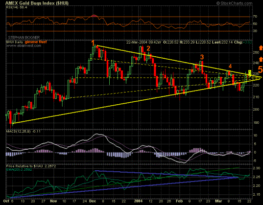
Similar phenomenon can be noticed between the XAU Index and HUI Index. While the XAU is already trading above its upper leg, the HUI is still captured in its triangle. A breakout is about to occur.


In the last weeks there were dominating pessimistic market forces in the gold markets (the POG, HUI & XAU were trading beneath their respective triangles´ legs), because the U.S. Dollar Index was rising strongly from 85 to 90 points. Between June 2003 and January 2004 the U.S. Dollar was being traded in a downward sloping triangle. At the end of January 2004, the Dollar surprisingly broke out the upside. A pullback to the apex followed, after which the Dollar is now trying to thrust to the upside. If this thrust is sustainable and able to trespass the important 90 points resistance zone, it might be decided by the recent (small green) triangle. Last week it broke to the downside, which could be a first indication that the entire break out of the superior (red) triangle to the upside is a fake-breakout. This is being confirmed when the U.S. Dollar Index breaches the 85 points and crashes below.

The recent trading days showed that it is not the U.S. Dollar that starts a certain price movement and hence the gold price reacts follows - it is the other way around. Furthermore, gold is giving the impression of wanting to thrust out of its triangle(s) to the upside. I can not say if gold will be forcing the Dollar to go down, but I can say that the time seems to be ripe now that gold is decoupling itself from the dominant price influence of the Dollar.
The Euro and Rand gold price are indicating a soon and strong rise (or crash) by their intact triangles. A breakout to the upside would suggest that the gold price is (finally) rising as well in Euro and Rand.


While copper, aluminum, platinum, palladium, rhodium, silver and other commodities are already breaking out, there is only the "black gold" missing besides the already-mentioned yellow metal.
Oil has been moving within a massive triangular price formation since 1996/1997 - with the apex pointing at $40. Although the apex is positioned one or two years in the future, a breakout can occur anytime.
Albeit the oil price has been rising relatively strong in the previous years, the price was chart-technically speaking moving within boundaries. The prior volatile rise within the triangle will look relatively "boring" compared to what kind of volatility will be set free in case of a to-the-upside-thrusting triangle.

In the lower part of the above oil chart one can see the relative performance of oil against gold. It is interesting that both prices move in a triangle as well. A to-the-upside-breaking triangle indicates that the oil price is rising faster than the gold price, whereas a downside-breaking triangle suggests that gold is rising faster than oil. Both scenarios seem possible, but I can (unfortunately) not say which one will occur and why.
A look at last week´s gold trading might reveal how the gold market participants have decided in terms of their triangle and the $400 price mark:

The answer in my humble opinion: $400 = Support
On Monday the POG tested the $400 "a last time" from below, shot above it on Tuesday and marked $402 as support zone for $400. On Wednesday the POG moved in a widely stretched triangle during the New York trading session. At 12:05pm the POG broke above upper leg to $403. At 12:50pm the pullback was completed at $402 and the POG made it in the remaining 45 minutes to thrust $4.50 to $406.50. Silver was captured in a similar triangle, whereas it seems remarkable that it was gold that was breaking out first. Therefore it is still the POG who determines the POS in crucial moments; even if silver started to thrust earlier than gold. There is only the conclusion left that I felt kind of sad that despite these beautiful intraday-triangles, the New York trading session had to stop. On the other side, some few might have felt happy or to put it correctly: defined this event as "timing."


I was happy the next day when I discovered a triangle before NY trading began. After 6 and 4 waves, the triangle was completing exactly with the starting-signal in NY by breaking out in the first minutes. In the following 40 minutes it undertook a pullback to the apex before starting to thrust at 08:50am from $407 to $412.


After this, the POG consolidated for about 80 minutes and took the shape of another triangle which crossed the upper leg after 4 waves at 10:45am. After the pullback was completed, the POG thrusted above $412. With the help of this triangle, the $412 resistance was being transformed into support. After this successful thrust, the $412 price mark was being tested for another 80 minutes from above. This was being made again in form of a triangle, which broke out after 4th wave at 12:05pm. Until 12:30pm gold pulled back to its apex and began thrusting again. At this point, there were only 60 minutes left for NY-trading and the POG already rose by more than $6 that day. The beginning thrust stopped abruptly and crashed beneath supporting $412. At 13:30pm the gold price was being fixed at $410.70 and rose that day by $4.20.
Similar picture on Friday: Just before NY started trading, there were already 4 waves within a triangle completed and in the first minutes a breakout and pullback occurred. Having done so, the POG thrusted immediately to $413. Right after this thrust, gold was forming another triangle to test $412 from above another time. At 10:45am the breakout and pullback started. At 11:00am the POG began thrusting, but this thrust was again not holding and crashing fast. In 23 minutes the POG lost around $3 and found support at $409. After 45 minutes the POG surprisingly started to rise. In the 70 minutes that were left in NY, gold rose to the direction of $412 and succeeded in the last minute(s) to close above this significant price mark. Hence, this "unsuccessful" thrust can be defined as a fake-breakout.


Silver was not able to thrust out of its triangle to the upside on Friday, but only because gold was having "difficulties" and is leading the pace in such decisive moments of truth/thrust. On the other hand, silver was presenting the recent metal-strength by showing that despite a crashing POG, it was able to hold slightly below strong support at $7.42 and after 90 minutes started to rise 11 cents to $7.53.
In the bilingual gold-forum-thread, I am presenting such intraday-charts regularly as soon as I discovered a formation with definite effects. Most of the times, I am pointing out a potential thrust out of a triangle minutes before they occur. Besides my simple charts, there is a vast amount of professional collected gold-news and comments from other goldbugs day by day.
As already mentioned, the popular stock markets were a serious competitor for the gold market. The following last charts shall point out that it is not only the gold market that prefers trending in between triangles, but paper-markets as well.

From 1995 until 2000 the Dow Jones rose "unstoppable" from 4.000 to 11.500 index points, which upside trend was marking wave 1 in the triangle. Wave 2 was that long and holding sky-high that it was 3 years later that wave 3 could start, which began in March 2003 and ended a few days ago. Wave 4 is about to move in the direction of the lowest leg. Price objective of wave 4 lies henceforth between 8.000 and 9.000 points - depending on how long wave 4 needs. When wave 4 is completed, the Dow Jones might rise "a last time" to the upper leg (= wave 5) and start an impulse-movement anytime either to the upside or downside. Even if the apex of this massive triangle lies in the year 2006, the legs might be breached sustainable anytime after wave 4 and a thrust may begin.

The triangular story looks similar for the S&P500. Recent wave 4 has a price objective of 850-900 index points.

The German Dax impressively shows that triangular legs can be breached for a short period. Recent wave 4 has a price objective of 2.900-3000 index points.
With the following last chart, I allowed myself to reduce the long-term chart of the Nasdaq not to one but to five price periods.

The first triangle succeeded to break out with 5th wave. A pullback followed before the Nasdaq began to thrust. This thrust took the shape of another triangle (#2). Interestingly at this stage of the bull market, the decisive 5th wave did not make it to break above and hence broke beneath lower leg - but must be defined as a fake-breakout, because the Nasdaq crossed the upper leg, broke out and pulled back to the apex and began to thrust sustainable. This thrust again was in form of a triangle (#3). It seems remarkably that this "last bull market triangle" needed more than 5 waves to finally break out to the upside. This breakout was relatively big (from 3.000 to 5.000 points). The pullback to the apex seemed to hold at 3.300 points, but the Nasdaq did NOT succeed to thrust above the 5.000 resistance-points that were marked by the pullback before. Analogous to the gold price at the end of 1970s/beginning 1980s, the Nasdaq only thrusted to exactly half of the previously pullback. In contrast to the price of gold, the Nasdaq was NOT able to hold above the apex at 3.300 points ($330 gold). Therefore, the thrust of the 3rd Nasdaq-triangle can be classified as a fake-breakout, because it crashed sustainable and compliant to the rules below the apex. This was NOT the case in the gold market, since gold continued to trade near its apex. Such a behavior can ONLY be labeled positively for gold; namely that the beginning thrust was not a "fake," but only - postponed.